
Dealfinder
A styleguide compliant and responsive interface redesign
A styleguide compliant and responsive interface redesign
Interface Design
UX-Designer
Product Owner
Frontend Developer
1 Month
Internship Project
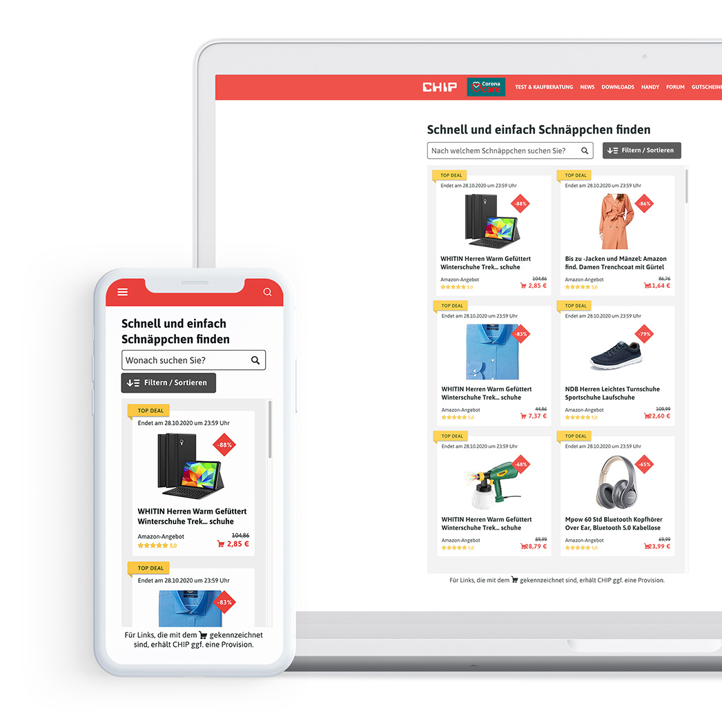
Before my internship, the “CHIP Test- und Kaufberatung” department developed a deal finder as MVP within one OKR cycle. This shows particularly discounted offers from different providers such as Amazon, Saturn and Mediamarkt and is used, for example, in articles about Amazon Cyberweek. Since the concept of the dealfinder had proven its value, it now needed to be adapted to the styleguide and its usability improved. The project was subject to strong technical restrictions because it had to be rendered as an iFrame. This meant, for example, that the dealfinder could not be higher than 600px in order to be displayed in the mobile amp version.
The main goal was to visually adapt the proof of concept to a modern, intuitive and true-to-brand design. For this, I conducted a requirements analysis as well as a prioritization workshop with the main stakeholders. My personal goal was to make the product tiles more modern and clear without losing important information for the users, while keeping the development effort for the developers as low as possible. For this I designed more than 30 variants of the product tile over three iterations until the final solution taking into account a brand style guide and technical requirements.
View final designStakeholder interviews
Prioritization workshop
Product tiles
Filters and sorting functions
Design presentation
Handover for technical implementation
Since a (user-tested) proof of concept was already available, I first worked my way into the status quo of the project. From previous user research, it was known that the feature was frequently used and clicked, but the design was considered outdated. In addition, the dealfinder could not be used on mobile devices in an intuitive way.
As a starting point, I conducted a stakeholder mapping on miro to identify project stakeholders. I conducted interviews with stakeholders from the “Core Team” as well as the “Involved” to determine the various requirements for the redesign.
The collected requirements (especially concerning the information to be displayed in the product tile) were then prioritized by all stakeholders in a workshop. Thereby, they were clustered into the categories “mandatory”, and “nice to have”.

Together with the colleagues we defined requirements and ideas for the product tiles that resulted from the Proof of Concept, the stakeholder interviews and the prioritization workshop.
Mandatory
• Product name and picture
• Deal end / runtime
• Price (new and old), incl. shopping cart icon
• Discount (in % or €)
• Vendor
• Sort function (discount, price, vendor)
• Filter function (price range, vendor)
• AMP support (height max. 600px)
• Usable on the phone, tablet and desktop
Nice to have
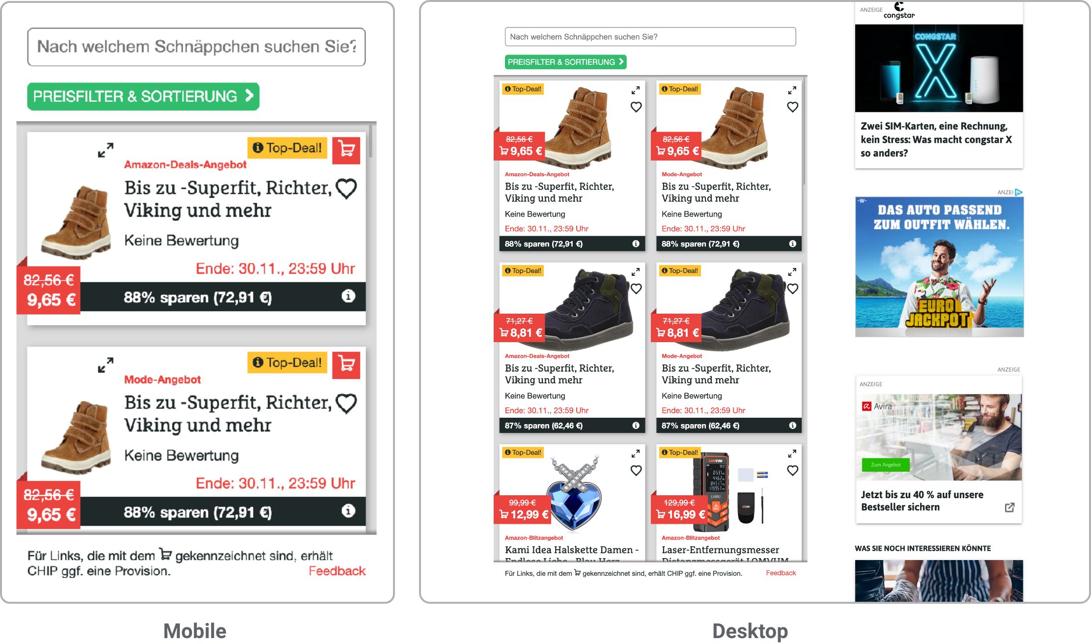
• Labeling: top deal / highlight deal / ad (+ info icon)
• Rating
• Image enlargement (idea: magnifying glass at the top right of the image)
• Heart icon for “Saved Deals” (only saved within the session)
• Categorie Filter
• Search field
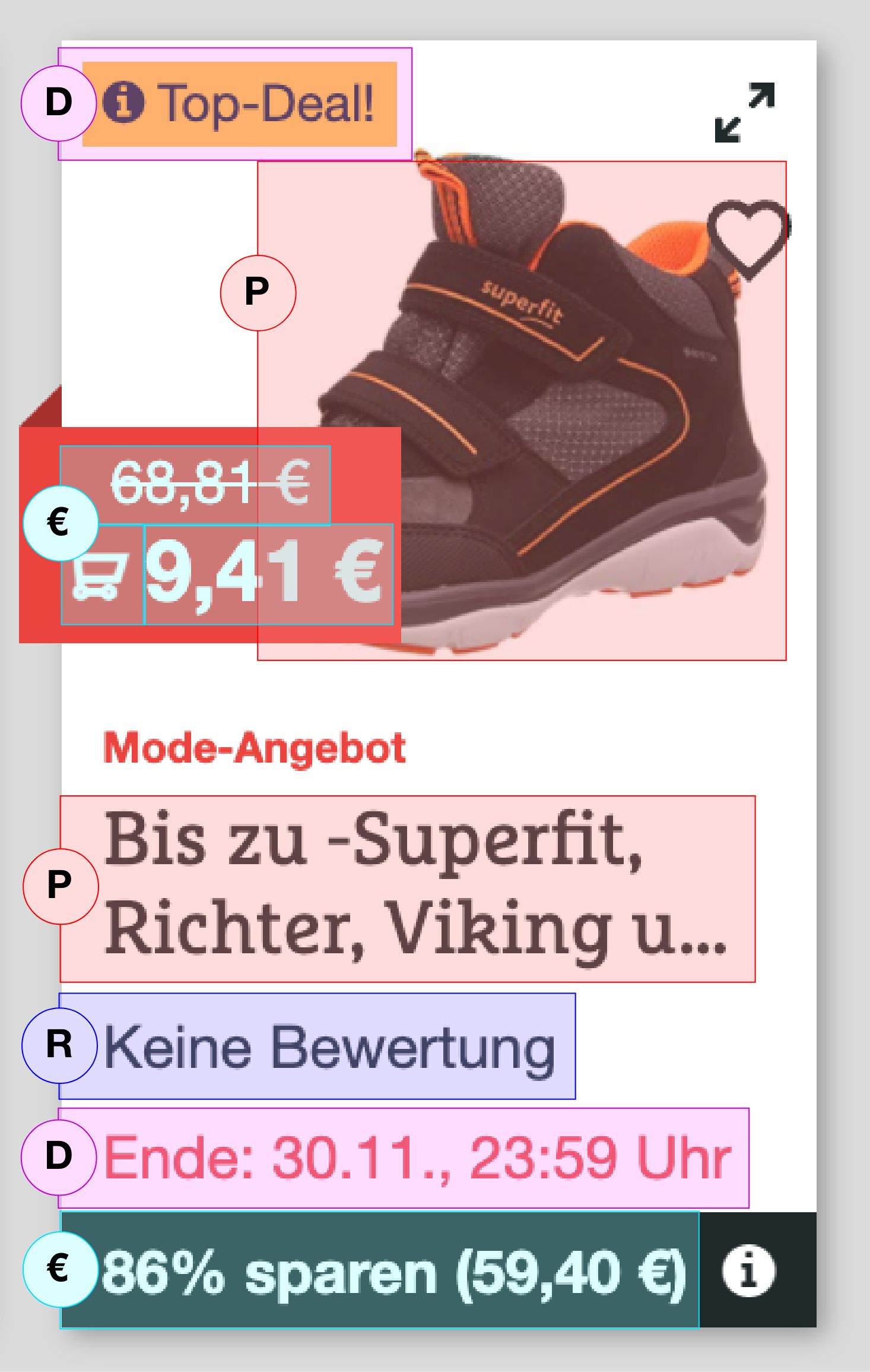
When designing the product tiles, I considered initially how I could divide the tile thematically in a meaningful way. Then I defined the following clusters: deal area (type of deal, duration), product (image, name), rating (provider, stars), price (deal price, affiliate marker, strike price).
For example, I noticed that important related information regarding the price or information about the deal was visually very separated from each other and distributed on the tile.
Therefore, I took the defined categories into account when redesigning the tiles to visually connect thematically related elements in a better way and thus reduce the cognitive load of the users when viewing the product tile.
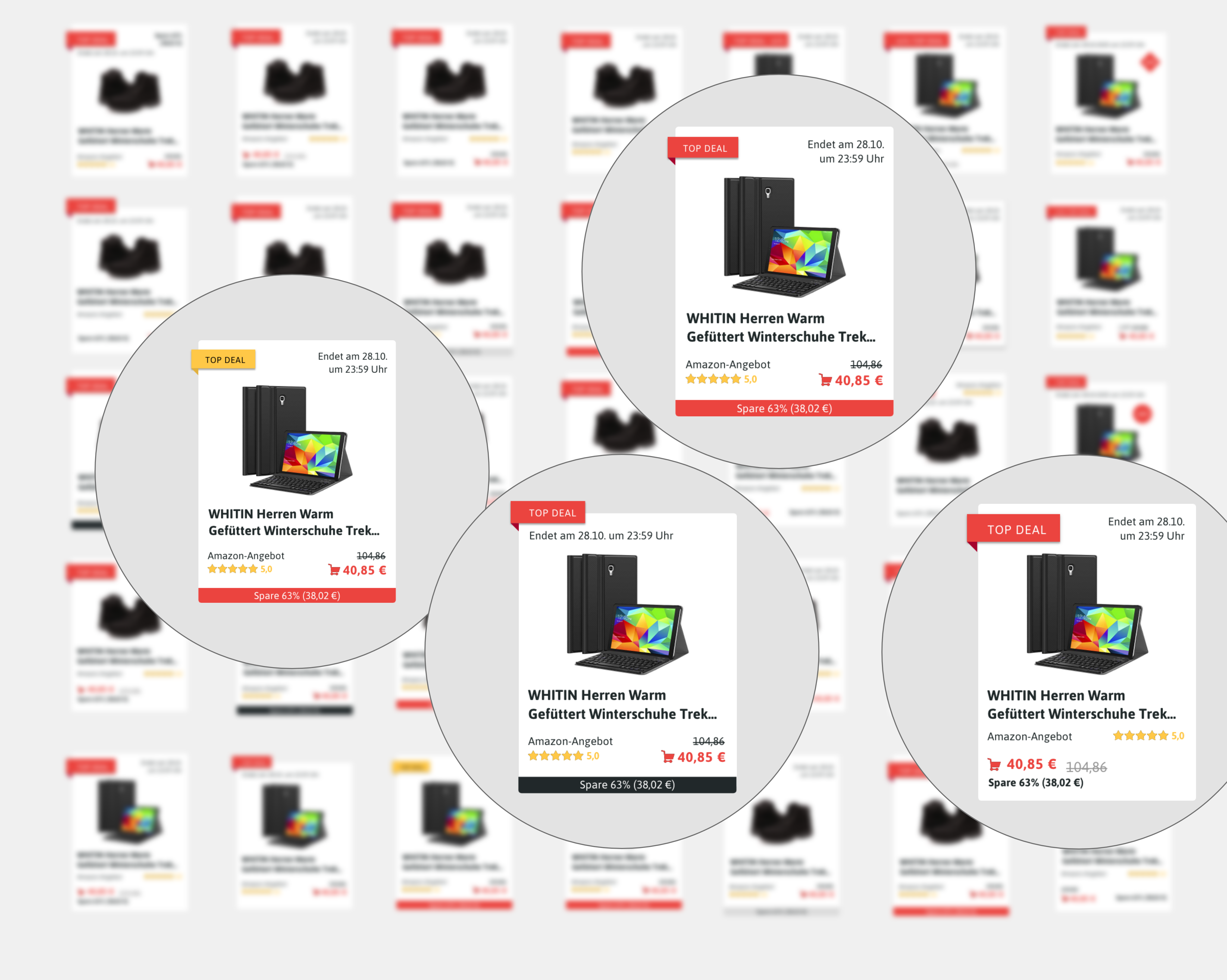
In three iterations, I designed over 30 variations of the product tile in “Sketch”, each with a different focus. To speed up design time and incorporate brand characteristics, components from a CHIP Design System were used.
In collaboration with the product owner and the front end developer, the variants were narrowed down to four tiles based on technical feasibility, user experience and business strategy.
The four product tiles were then tested quantitatively with users using the tool “Optimizely” on the live website via A/B testing in order to examine the click rates of the users and conversation rates.
The findings of the A/B test were then used to generate the final product tile.
The finale product tile bundles elements that belong together in a thematically meaningful way. The user’s gaze should be directed to the product image and the discount in order to make the most important information “What product am I being offered?” and “Is it a good offer?” immediately comprehensible and scannable. After that, further detailed information can be obtained, such as the price or the ratings on the provider’s website.
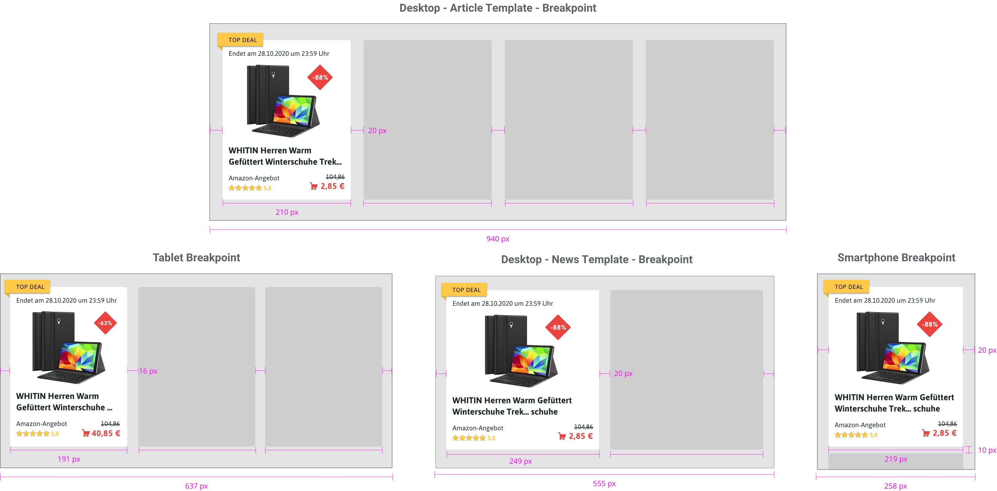
After the product tile was finalized, I now focused on the “Sort and Filter” function. Here the user can filter by price range and retailers or sort by “discount”, “price ascending” or “ price descending”. The challenge here was to make the options accessible, to make it visible to the user that his set filters have an impact on the overview and to keep the technical restrictions of 600 px height on mobile devices and that the logic works responsive as well as on different article templates.
As a basis for the communication with the product owner and the frontend developer I developed a technical implementation concept, which defines the responsive behavior of the dealfinder using CSS Grid.
For this, breakpoints were defined for the different devices and page layouts. The minimum and maximum width of the product tiles as well as the number of columns were defined. Eventually, the concept was adopted and implemented by the developer, and the development time was shortened, in addition a consistent look and feel across devices were achieved.
For the handover to the developers I used the tool “Zeplin” to provide pixel perfect screens. Special features were marked and commented directly on the provided designs. I also remained in contact with the developers through weekly jour fixes to further supervise the implementation from a design perspective.

The project was a lot of fun. The individual work as well as the work in the project team was well-balanced. The feeling of seeing my designs on the live website after so many iterations and work, and reaching so many people was extraordinary.
The project had a focus on the interface design under a tight schedule, so cutbacks had to be made in the user research. I would have liked to get more (qualitative) insights from real users, but we couldn’t include it in my time as an intern.
However, I have sent the recommendation to the responsible colleagues and I am curious about the further developments and KPIs of the Dealfinder.
• Applying design principles for desktop and mobile devices, considering a brand style guide
• Taking into account technical constraints, stakeholder requirements, and user needs
• The utilization of design systems and components